Points Of Departure: Foundations Exhibition
This collaborative design served as the identity for the introductory-level art exhibition at the University of West Florida. Points of Departure provides an opportunity for intermediate artists to showcase their work on a professional level.
The Game Plan
Points of Departure provides a platform for those with a passion in fine arts.
Upon reading our client brief, we understood that the participating students come from various introductory-level art classes, showcasing work from students of skill levels. Our goal was present this identity in a way that emphasized the importance of foundation within all aspects of art.
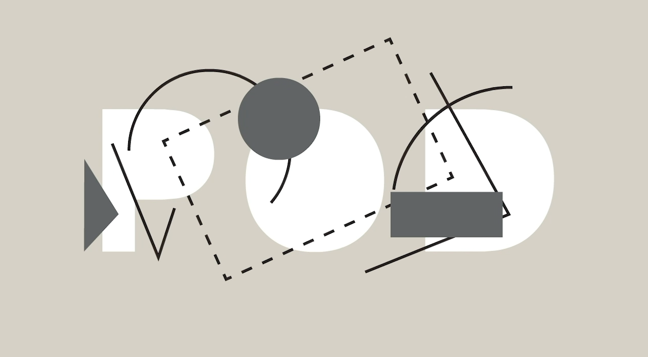
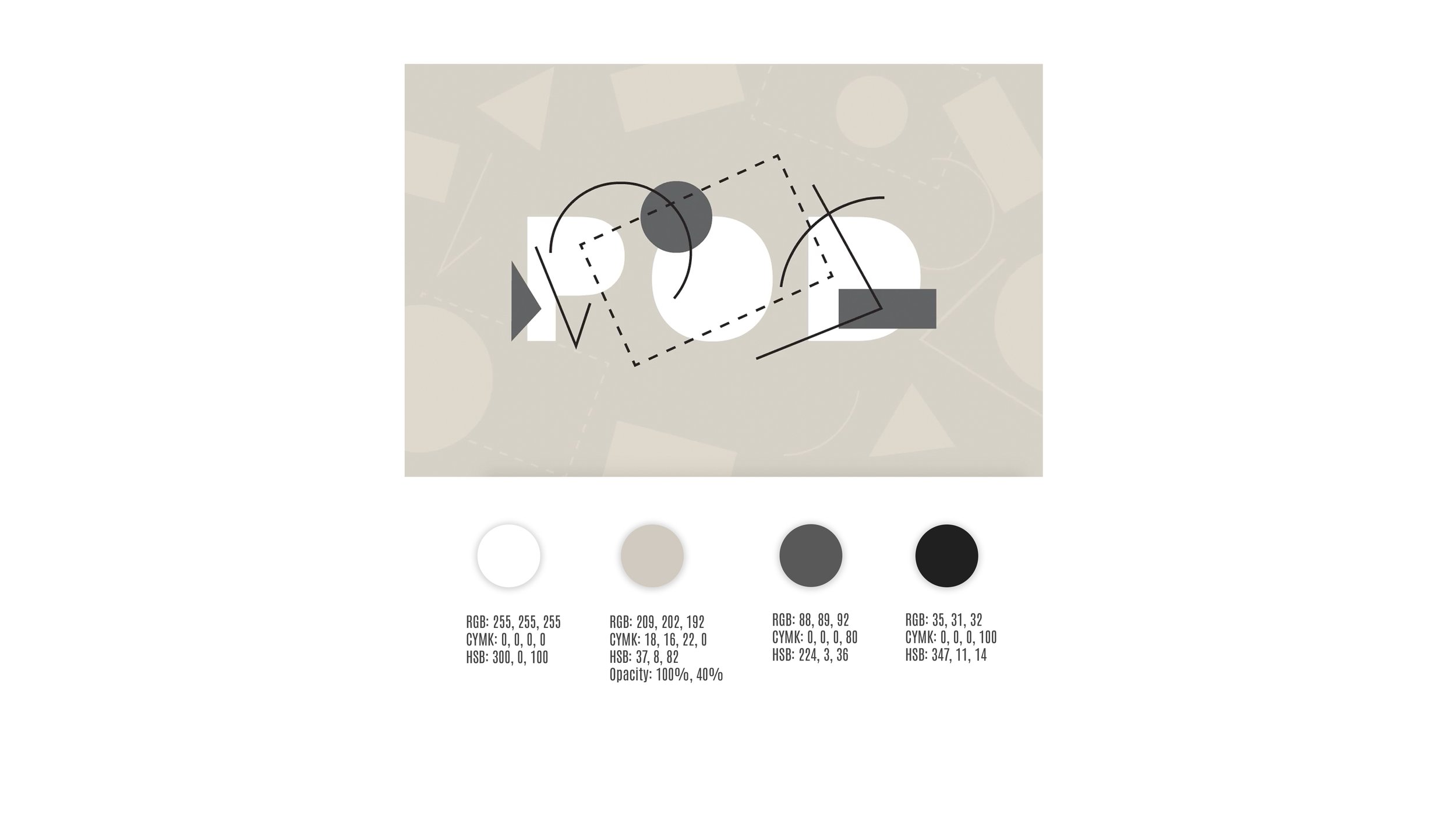
Based on this dynamic, our team created a composition influenced by Bauhaus characteristics, due to his emphasis on geometrical and linear forms of minimalism. The final designs reflected his principles, displayed by using greyscale, basic shapes, and lines to represent the foundations of design.
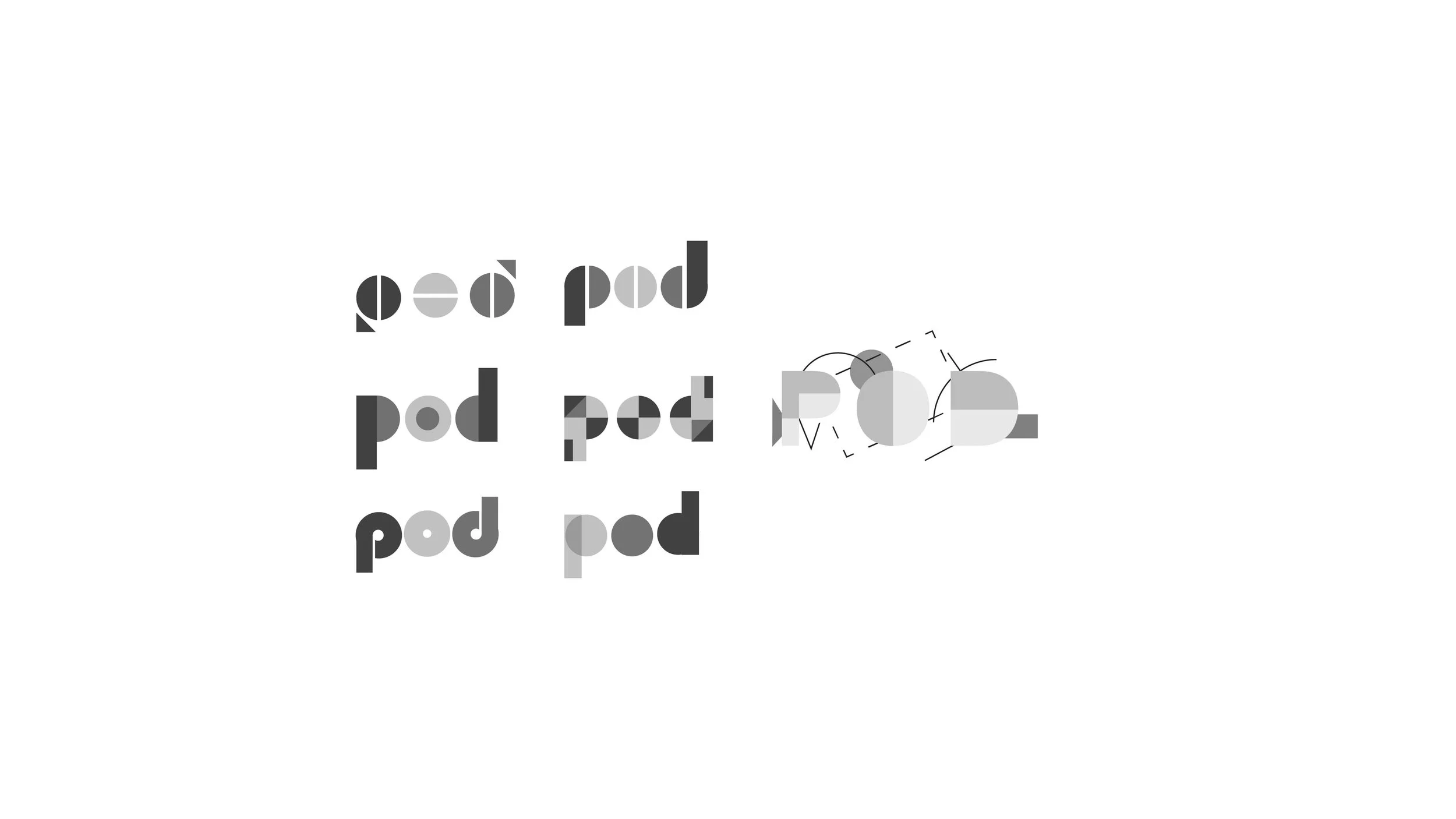
As with all of my graphic design projects, I followed a five step process that I have listed on the right. The images below display some of the in depth steps that I have taken to reach the final design.
-
The beginning of each project starts with understanding the needs of the client. Our goal was to emphasize the foundational aspects of art, regardless of the medium.
-
Keeping the client brief in mind, we came to the conclusion of incorporating basic shapes and lines in our identity. We researched the principles of Bauhaus, taking influence from his approach using simple geometrical, linear forms.
-
Given our two month timeframe, we developed and followed a strict schedule to keep us on track. We split the work between us to stay efficient and regrouped to finalize our drafts under our agreement.
-
After getting our identity approved, we continued its development. With the title wall being an animation, I took our vector designs and created an animation via Adobe Animate.
-
After implementing all of the final adjustments, we launched all our deliverables and successfully set up the title wall before the opening day of the reception.
Animated Title Wall
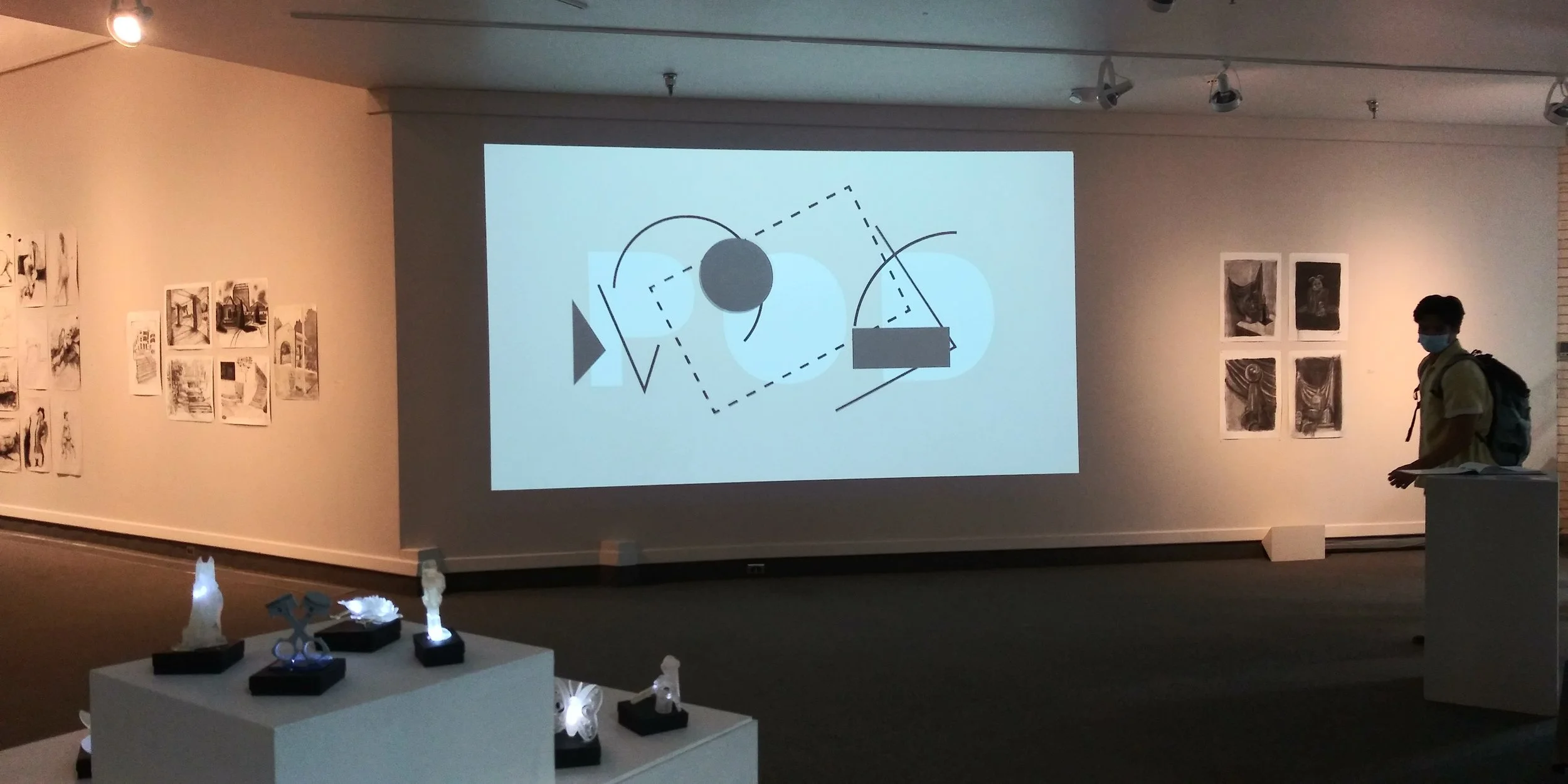
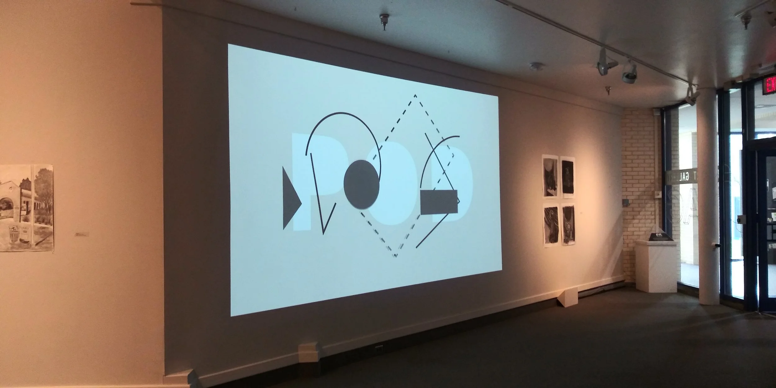
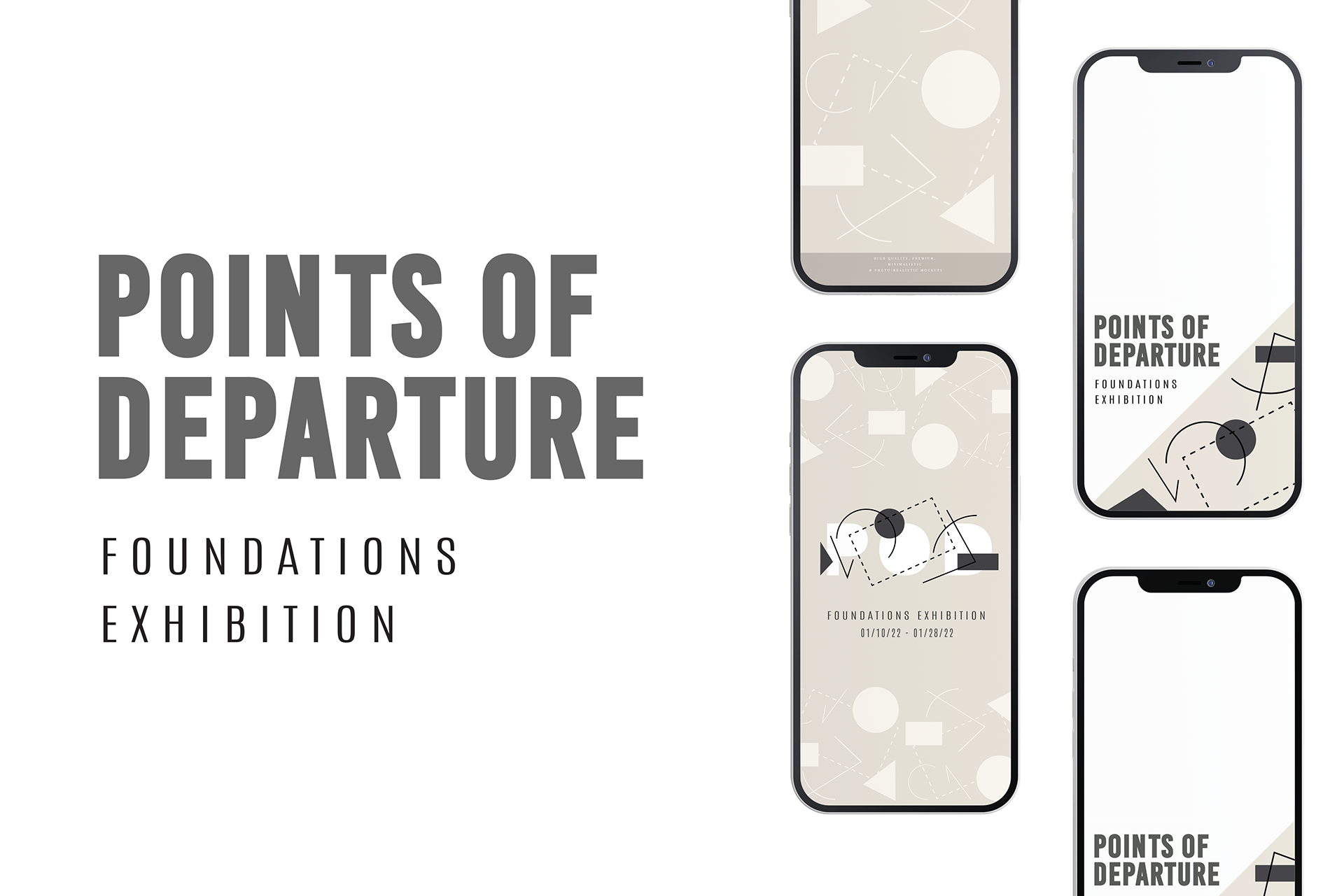
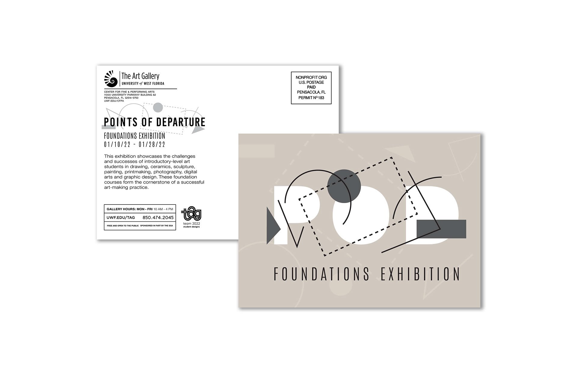
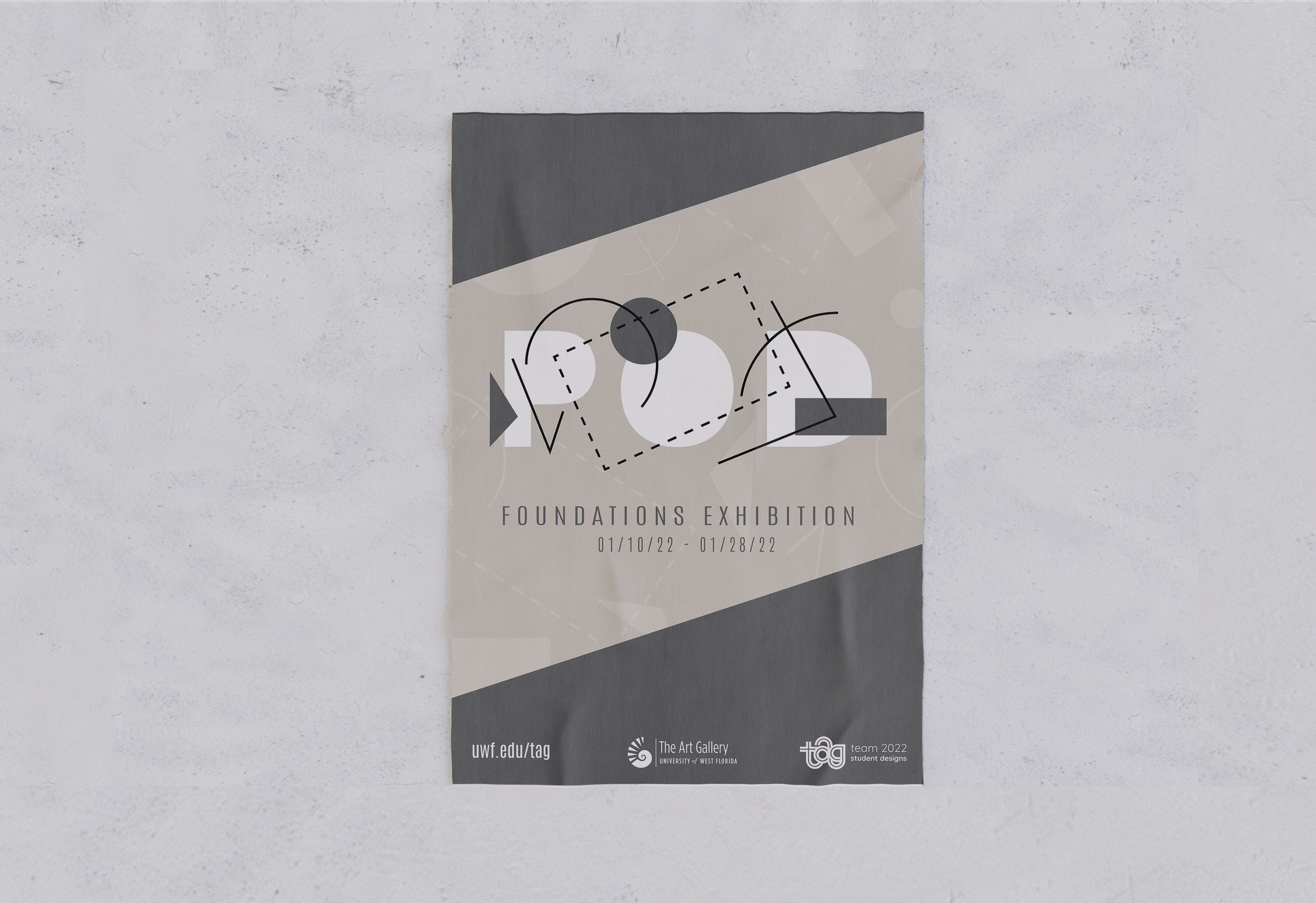
After advertising this exhibition through social media graphics, posters, and postcards, the design has established itself with a firm identity. It wasn’t until the opening day of the when the animated title wall was revealed, bringing the POD logo to life. The movements of the shapes and lines were designed to mimic the process of fundamental creation.


